
Change has become the new constant as everything’s changing by the moment. Whether it’s time, your habits, and even your trivia knowledge as you go over this blog that lists down the web design changes in your favourite websites over the years. Drawing from Darwin’s theory of survival of the fittest, these websites have been reigning the internet as they adapt to the different technologies, layouts and designs. Owing to CSS and other advancements in web browsers, these websites have undergone several makeovers that paved the way to their prominence in our cultural zeitgeist. So, let’s have a look at how these popular websites have surfed the tide of time and evolved in terms of UI/UX designs.
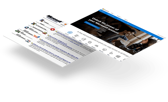
Microsoft had already established itself as a tech giant in the 1990s, capturing almost 90% of the world’s market share, then. Although functional, its website didn’t boast of any revolutionary designs. Showcasing the technical software as part of storefront trends that was popular in the late 2000s, the textual content took most of the space.
However, in the following years, Microsoft bid farewell to the outdated navigation bar design and welcomed the clean and crisp look that focuses on consumer lifestyle with large banner images and lots of whitespace.
Apple’s website is one of the best-looking websites that favours the dark theme mode along with an elegant and minimalist design that sets it apart from others. But it wasn’t always like that, despite the website being there for more than two decades, Apple’s earlier design looked more like a newsletter which later got modified with filtered content and dramatic images of its products.
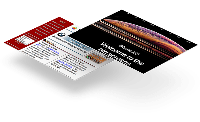
With Steve Jobs being a firm propagator of skeuomorphic design, the website and Apple products in the 2000s resembled the characteristics of real-life objects. However, Apple’s website has come a long way since then with a flat and sophisticated look that makes it one of the top designed websites.
eBay may not be as popular as Amazon, but it surely changed the way we used to shop. Although it started as an auction site, eBay soon added numerous products and categories to be bought and sold. With loads of content and colours used to highlight the categories and ads section, eBay’s website design was a jumble of colours and text for many years.

With an almost similar layout and homepage for 15 years, eBay got a makeover in 2015 and now resembles an E-commerce website with colour blocks that give it a more elegant look.
Resembling Google’s homepage, YouTube’s look was pretty ordinary consisting of just five videos and a large search bar when it was first launched in 2005. However, in the following year itself, it boasted of personalised user-profiles and video ratings among other design and usability changes to make its place in the list of popular website designs.
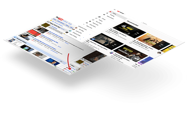
Over the years, YouTube has had quite a few changes made on its homepage and watch page. With a more minimalist edge to the layout, this visual platform seeks to become more accessible for both viewers and YouTube with the UI-UX redesign.
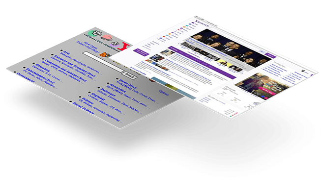
If you think Yahoo has a jam-packed look now, then you should have seen it when it was launched in 1994 by Jerry Yang and David Filo. With a simple list of links and a guide to the open web, the website gained a heavy text look over the years, that made it seem more like a cluttered mess.
While the flashy graphics no longer featured in the later designs, Yahoo still retained it’s jam-packed look that didn’t go away despite the several redesigning attempts and serves as a lesson to all those looking for a website redesign.
The New York Times started as an alternative website for the print format in January 1996. By 1998, the homepage offered larger headlines and images that gave it a sleeker look. In the following years, its homepage featured a plethora of articles and a classified section too.

Now, the New York Times website is more streamlined and resembles the print version with white background and black text that makes navigation between articles easier. The redesign was conceived with the readers in mind who when investing in NYT’s journalism online should get the same user experience— supplies Denise Warren, the Executive vice president of digital products at The New York Times.
The reigning champion among all search engines for many years, Google has always set the trend as one of the most popular website designs. Since its launch in 1997, Google’s homepage underwent minor changes in its design with the colourful logo occupying most of the space, with several links under it.
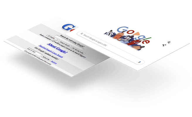
It was only in 1998 that Google transitioned to a single search bar with the trademark logo that got redesigned in 1999. With very few changes since then, the site has retained a more minimal look with the Google doodle as one of its most interesting features.
Skype was first launched in 2003 and permitted voice calls from PC to PC. It was only in 2005 that it revolutionised the internet with its video calling function.
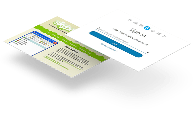
With new versions appearing now and then to accommodate the new features, the design has also gone through various makeovers, but none too revolutionary.
Did you know that Twitter was created in 2006? In its early stages, the website detailed the functions it served as a social networking app.
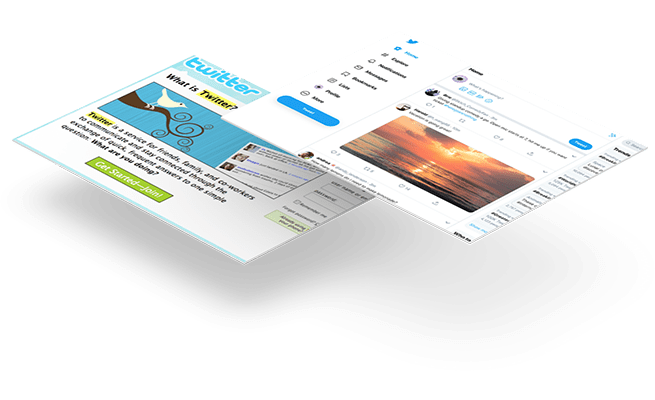
With many changes in the design, including the Twitter blue background, the website has now joined the ranks as one of the popular networking apps that need no introduction and is one of the top designed websites today. The homepage design is also a perfect example of minimalist design with simplicity and subtlety as its cornerstone.
Fashion websites are one of the best-looking websites that provide an avenue to check out the popular trends in designs, and there’s none better than Guess that made its internet debut in 1999.
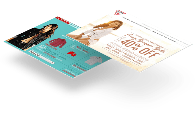
With multiple links that only cluttered the page, this fashion website has completely revamped its design since then, promoting visual content more than text to catch the eyes of their visitors.
Reddit has always been a text-heavy website. It is a maze of information and also resembles one. Since its launch in 2005, the website has had some subtle visual changes in the design. Owing to this challenge, the team of designers went through a lot to make sure that this text-heavy website also appealed to the Redditors visually when the ‘New Reddit’ came in 2018.

Today, the website retains much of its old feel but has become easier to navigate and attracts more users than before.
In the 1980s, Micheal Jordan was the face of Nike and this sport’s goods manufacturer was doing pretty well for itself, but its 1998 website did not indicate it. With unfashionable images and barely-there text, the website’s design didn’t give any impression of what the brand represented.

Since then, Nike’s website has gone through many transformations with clear designs and darker themes that give the impression of a serious and sophisticated brand, and is also one of the best-looking websites of today.
To track the design changes over the years, there’s none better than Amazon. This online bookstore started in 1995 with a website that consisted of lots of grays and wasn’t very vibrant.
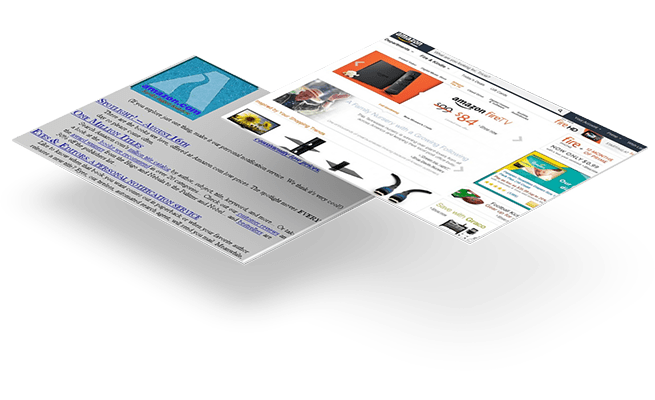
As Amazon’s interests went beyond selling books, tabs were incorporated for the toys, games, and electronics in the 1998-99 version. While the logo got redesigned in the 2000s, the website got a colourless redesign in 2012, giving way to a minimalistic and responsive design that we see today and is also one of top designed websites in the E-commerce industry.
Almost all of these websites have tried to adapt to the changing times by adopting designs that made them look more like a virtual museum. Going for minimal but engaging content and buttonless interactions, these websites have overcome the tide of time and change with UI/UX redesigns to enhance the customer experience and win their loyalty in return.